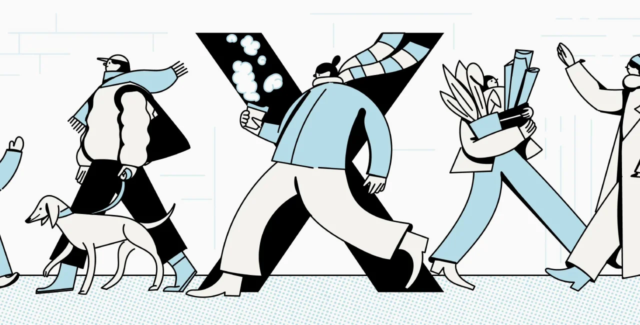
Like the social network formerly known as Twitter, Prague 10 has taken a unique new approach to its visual identity. Utilizing a contemporary approach that speaks to its vibrant community, official communication from the district will now prominently feature the logo "X", after the Roman numeral that represents 10.
The district recently concluded a design competition, and selected a proposal by design studio MadLove featuring the prominent use of the Roman numeral X as its main visual element. This bold choice signifies a departure from Prague 10's previous use of the district's official seal for communication.
"Prague 10 is a colorful architectural mosaic, and the composition of people who call this part of the city their home is no less rich. However, for a long time we lacked a unified visual identity and a clearly recognizable logo that would unite us," Prague 10 Mayor Martin Valovič notes in a press release.
"The winning proposal from the MadLove workshop corrects this and gives us the opportunity to start building a unique brand. The new style will gradually be reflected in all communication channels, in printed materials and in the branding of the town hall."
Until now, Prague 10 used only the city coat of arms, which is historically associated only with Vršovice. District officials wanted a comprehensive system that could also be used digitally, similar to Prague 3, which unveiled a new visual identity in 2020.
"In our opinion, the symbol is straightforward and significant. We recognize it even when it takes on different forms and forms of execution. In this we see the power of identity. It encourages creativity and free interpretation," says MadLove's Pavel Mádl.
"It is not an impersonal, rigid sign, but a flexible communication language. That's why we believe that this identity is sustainable in the long term, it will change easily and, thanks to that, it won't get boring."
Prague 10's adoption of this new visual identity marks a significant step toward modernization and community engagement. With its distinctive logo and cohesive branding strategy, the district reaffirms its unique identity within the fabric of Prague, while also nodding to historical origins.
"The clearly recognizable letter X certainly stands out from other city districts," adds district representative Adam Šilar. "It's also inspired by the historical division of Prague's city districts from the first half of the last century, when Roman numerals were used."


 Reading time: 2 minutes